Listen, we get it. You've downloaded yet another "revolutionary" real estate app that promises to change your life. You open it, see 47 buttons, 3 sidebars, and what appears to be a NASA control panel, and think "I'll figure this out later." Spoiler alert: Later never comes. But Zonely? We made our home screen so intuitive, even your technophobic uncle who still uses a flip phone could navigate it. (Okay, maybe that's a stretch, but you get the point.) Let's dive in!
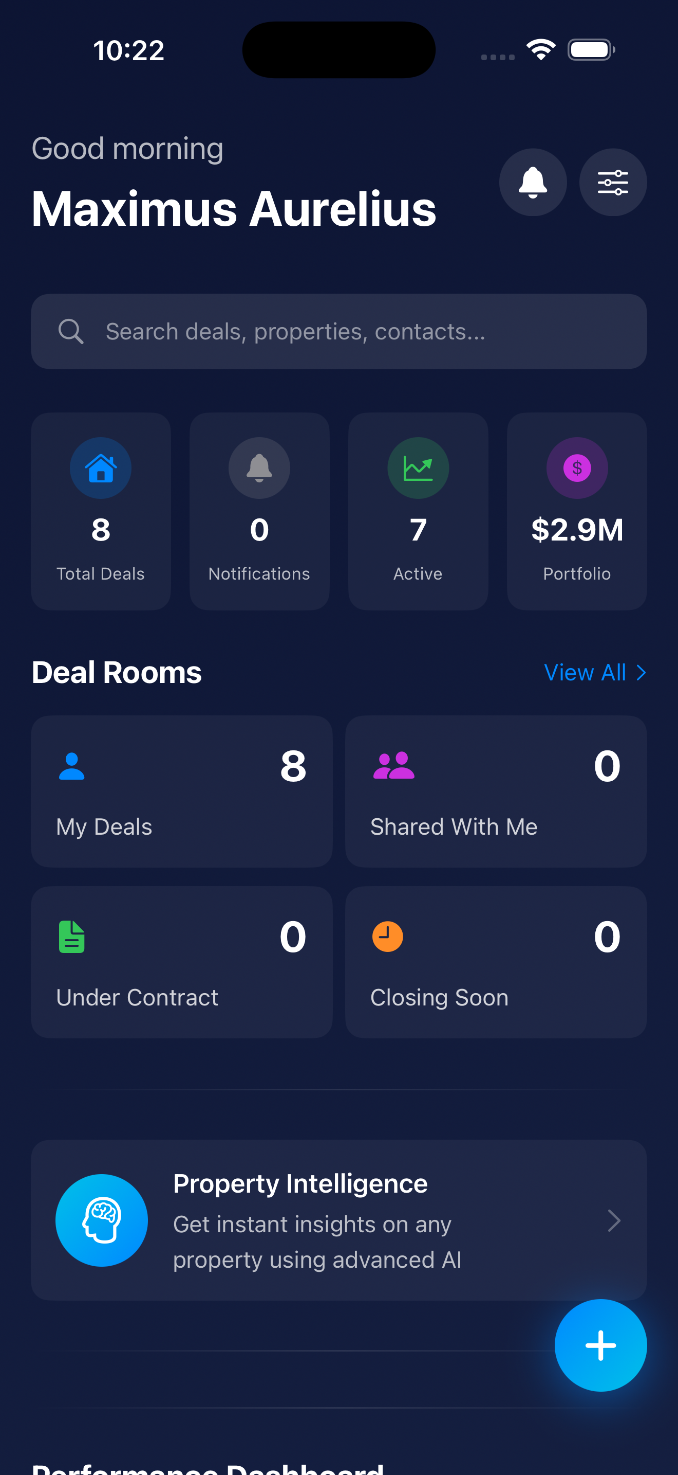
Think of the Zonely home screen as your real estate headquarters—but without the mahogany desk, uncomfortable office chair, or that one coworker who microwaves fish in the break room. It's the first thing you see when you open the app, and it's designed to give you instant access to everything you need: your saved properties, AI insights, Deal Rooms, and more.
Unlike other apps that bury important features five menus deep (looking at you, every app ever), we put the good stuff front and center. Because if you're house hunting at 2 AM in your pajamas (we don't judge), you shouldn't need a PhD to find your favorite listings.
Alright, let's get visual. We've got 5 screenshots for you, each highlighting a different part of the home screen. We'll go through them in order because chaos is for open houses, not blog posts.
👆 Click to enlarge
Welcome to your home screen—the nerve center of your real estate empire. This is where everything comes together in one beautifully organized dashboard. Let's break down what you're looking at:
That little bell icon? Tap it to see all your recent notifications—and here's the key: it's mostly for message alerts. When your co-investor, agent, or lender sends you a message in a Deal Room, you'll get pinged here. Red badge means you've got unread messages waiting. Think of it as your real estate text inbox, minus the spam about extended car warranties.
See those sliders with knobs at the top? That's your home screen customization tool—think of it like a mixing board for your real estate dashboard. Tap it to drag modules up and down, rearrange your entire home screen layout, and make Zonely work exactly how YOU want it to. Want Deal Rooms at the top and Property Intelligence at the bottom? Go wild. It's your app—we're just here to enable your organizational obsessions.
Scroll down just a bit, and you'll see your Deal Room cards organized into helpful categories. This is where the magic of organization meets the chaos of real estate:
Each card shows the property address, current stage, recent activity, and health score. Tap any card to dive into the full 16-tab Deal Room experience where you can manage every aspect of the transaction.
Here's where Zonely flexes its AI muscles. The Property Intelligence module lets you get instant, comprehensive analysis on ANY property—without needing to create a full Deal Room. Here's how it works:
Think of Property Intelligence as your "quick look" feature. You can analyze dozens of properties in minutes without committing to creating full Deal Rooms for each one. Once you find a winner, THEN you create the Deal Room and invite your team.
👆 Click to enlarge
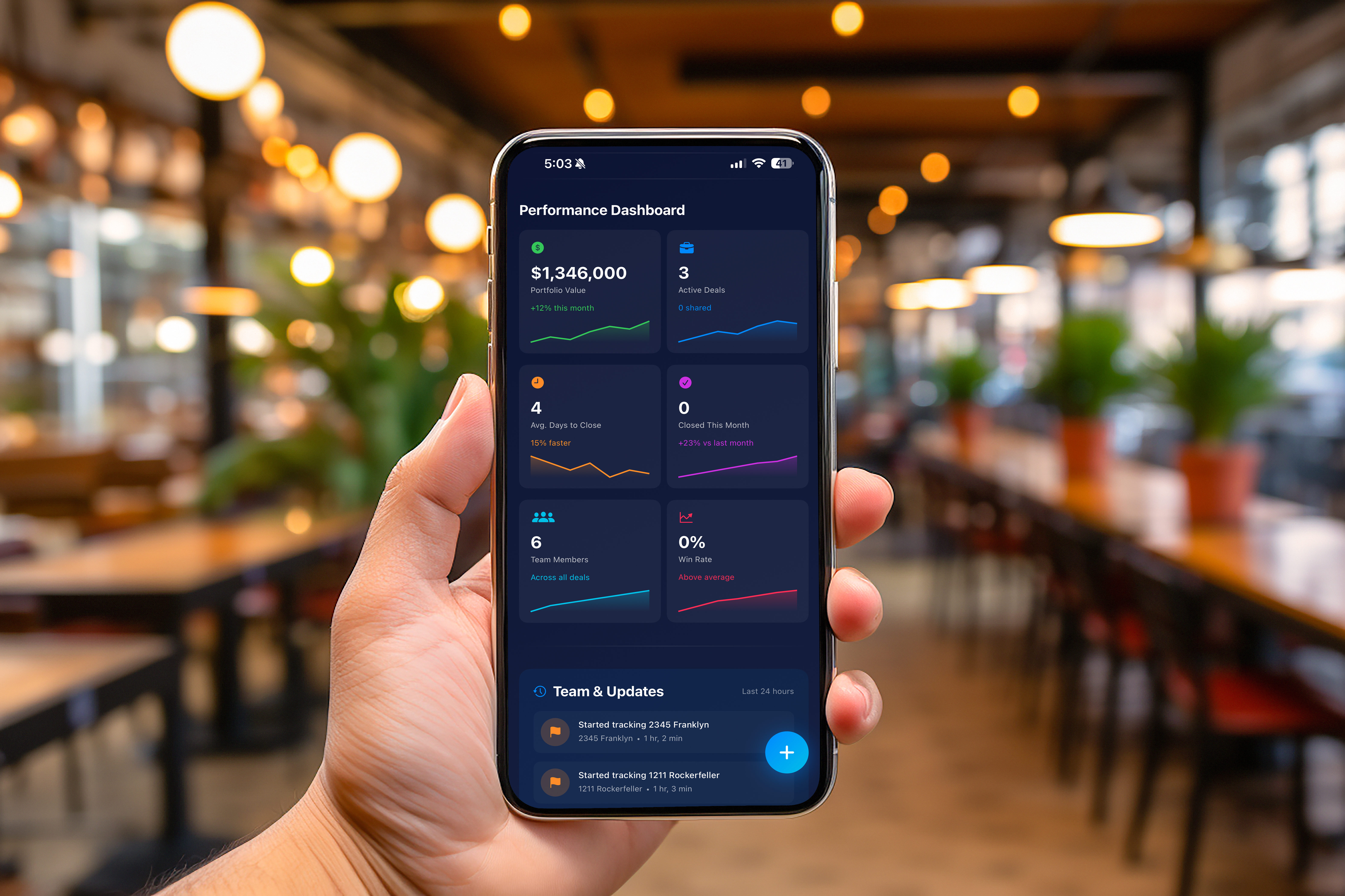
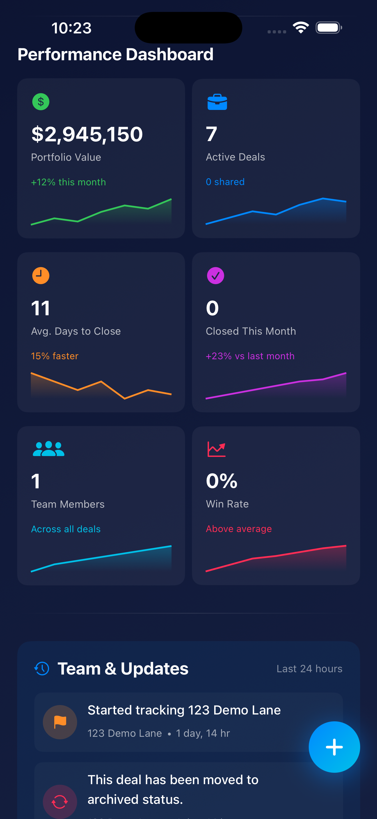
Welcome to the Performance Dashboard—where all your real estate dreams (and occasional nightmares) get quantified into cold, hard numbers. This is where data nerds and spreadsheet lovers unite. If you're the type who checks your portfolio value more than you check Instagram, this is your happy place.
The Performance Dashboard displays 6 key metric cards that give you instant insight into your portfolio's health. Each card includes a main metric, a trend indicator, and a sparkline chart showing historical performance. Let's break down what you're looking at:
What It Shows: The total combined value of ALL properties in your Zonely portfolio. This isn't just the purchase price—it's the current market value based on real-time data, comparable sales, and appreciation trends.
The Trend: +12% this month — Your portfolio grew by 12% in the last 30 days. Whether that's from property appreciation, new acquisitions, or successful renovations, your net worth is moving in the right direction. Champagne glasses up! 🥂
The Sparkline Chart: That tiny line graph shows your portfolio value over the past 6 months. If it's trending upward (like it should be), you're watching your wealth grow in real-time. If it's flat or declining, it might be time to reassess your strategy—or blame the housing market like everyone else.
Why It Matters: This is the big number. The one that makes you feel like a real estate mogul (or reminds you that you're one bad deal away from ramen dinners). Track this monthly to see if your portfolio is appreciating or if you're just treading water.
What It Shows: How many Deal Rooms you currently have in "active" status. These are properties you're actively working on—under contract, in due diligence, or actively managing.
The Subtext: "0 shared" — This tells you that out of your 7 active deals, ZERO are shared with other team members. You're flying solo on all of them. Either you're a lone wolf investor who doesn't need help from anyone, or you're about to discover the value of delegation. (Spoiler: It's the latter.)
Why It Matters: This number gives you a quick sanity check. Managing 7 active deals solo? That's a lot of plates to spin. Maybe it's time to invite your agent, lender, or property manager into those Deal Rooms so you're not drowning in paperwork and deadline reminders at 2 AM.
What It Shows: The average number of days it takes you to close deals, calculated across all your completed transactions in Zonely. This metric measures how efficiently you move from "under contract" to "keys in hand."
The Trend: 15% faster — You're closing deals 15% faster than your previous average. That's impressive. Either you've streamlined your process, found better lenders, or sacrificed a goat to the real estate gods. Whatever it is, keep doing it.
The Sparkline Chart: The mini graph shows how your closing speed has trended over time. If it's trending downward (lower days = better), you're getting more efficient. Trending upward? Time to identify bottlenecks—slow inspectors, laggy lenders, or your own procrastination.
Why It Matters: In hot markets, speed wins. The faster you can close, the more competitive your offers become. Sellers love quick closings. If you can consistently close in under 15 days while competitors take 30-45, you have a massive advantage. Flex this number when making offers.
What It Shows: How many deals you successfully closed in the current month. In this case, zero. Hey, it happens. Not every month is closing month—sometimes you're in acquisition mode, sometimes you're in planning mode, and sometimes Mercury is in retrograde and everything goes sideways.
The Trend: +23% vs last month — Wait, you closed zero deals but you're up 23%? Math isn't mathing. Here's what's actually happening: This compares your PERFORMANCE metrics (not deal count) to last month. Your portfolio value, ROI, or other KPIs improved by 23%, even though you didn't close any new deals. Your existing properties are working for you. That's passive income, baby.
Why It Matters: Don't panic if you see "0" here. Real estate isn't about closing deals every single month—it's about strategic acquisitions. What matters more is the +23% trend showing your portfolio is still growing even without new closings. That said, if you see "0" for 6 months straight, maybe it's time to submit some offers.
What It Shows: The total number of team members you've invited across ALL your Deal Rooms. In this case, it's 1. That means you've invited one person (probably your agent or partner) to collaborate.
The Subtext: "Across all deals" — This clarifies that the count is TOTAL team members across your entire portfolio, not per deal. So if you invited the same agent to 7 different Deal Rooms, it counts as 1 team member, not 7.
Why It Matters: Real estate is a team sport. If you're only working with 1 team member across all your deals, you're probably missing out on expertise. Consider inviting: agents, lenders, inspectors, contractors, property managers, accountants, or co-investors. The more eyes on your deals, the fewer mistakes you make.
What It Shows: Your "win rate" is the percentage of offers you've made that got accepted. If you've submitted 10 offers and 3 were accepted, your win rate is 30%. In this case, it's 0%—which means either you haven't submitted any offers yet, or you've submitted offers but none have been accepted (ouch).
The Trend: Above average — Hold on, how is 0% "above average"? This is Zonely's gentle way of saying "Hey, we don't have enough data yet to calculate your win rate accurately, but don't worry, you're doing fine." Once you submit more offers, this metric will become more meaningful.
The Sparkline Chart: Right now, it's probably a flat line because there's no historical data. As you submit and win (or lose) offers, the sparkline will show trends. Ideally, you want this trending upward over time as you get better at crafting competitive offers.
Why It Matters: Win rate is a critical metric for serious investors. In competitive markets, average win rates hover around 10-20%. If you're hitting 30-40%, you're a rockstar (or you're overpaying—be honest with yourself). Under 10%? You might be lowballing too much or submitting offers in overly competitive neighborhoods.
The Performance Dashboard transforms complex portfolio management into visual, digestible insights. Whether you're managing your first rental property or juggling a $50M portfolio, these 6 cards give you everything you need to understand your performance at a glance.
Bottom line? If you're not checking your Performance Dashboard regularly, you're missing out on one of Zonely's most powerful features. And probably leaving money on the table.
👆 Click to enlarge
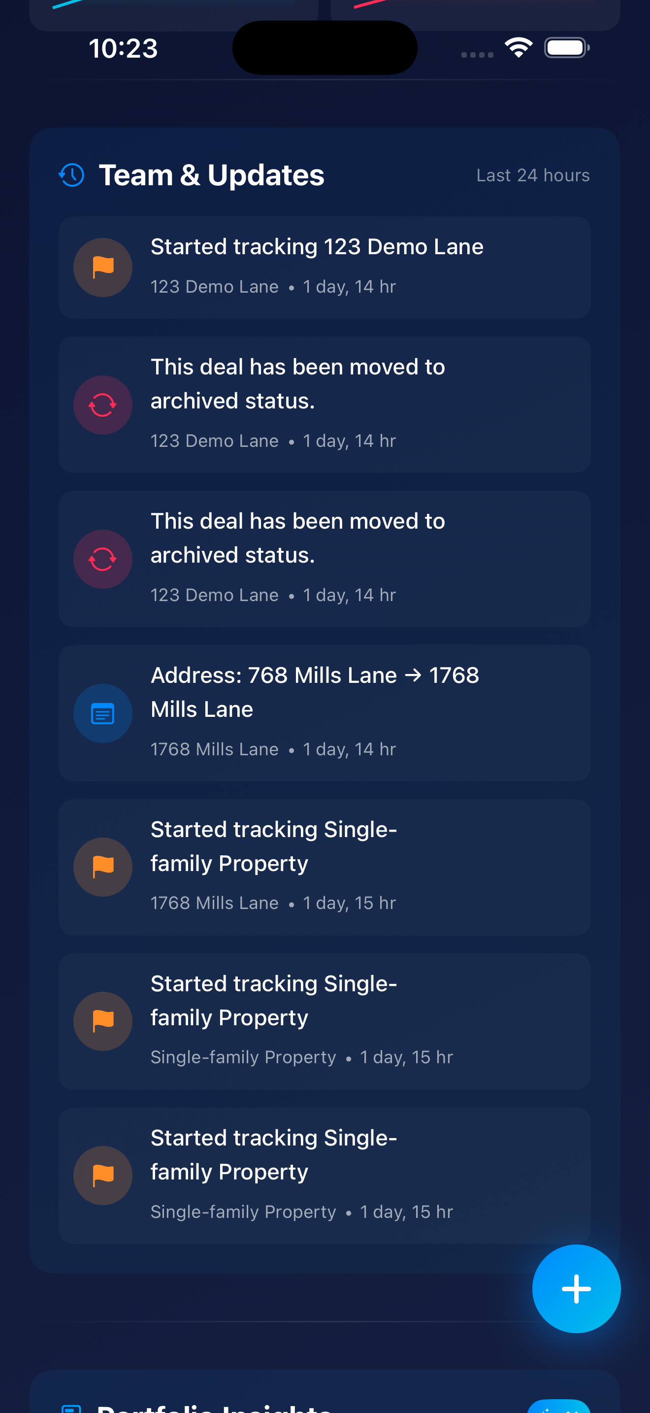
Welcome to the Team & Updates section—your chronological activity feed showing exactly what's happening across all your deals in real-time. Think of it as the Twitter feed for your real estate portfolio, except instead of hot takes and cat memes, you get actionable intel on your million-dollar investments.
At the top, you'll see the clock icon next to "Team & Updates"—this signals that you're looking at a time-based activity stream. The current filter shows "Last 24 hours", but you can adjust this to see activity from the past week, month, or custom date ranges. Perfect for catching up after a vacation (or just ignoring your deals for a few days—no judgment).
The activity feed categorizes every action into three main types, each with its own color-coded icon. Here's what you're looking at:
What It Means: Someone on your team (or you) just added a new property to the pipeline for analysis. This is step one in Zonely's deal workflow—a potential opportunity has been identified and logged.
Examples from Screenshot:
Why It Matters: This is your deal sourcing metric in action. Every tracked property represents a potential opportunity. The feed shows you (and your team) that the pipeline is being actively fed with new leads. If you're seeing 5-10 new properties tracked per week, your deal flow is healthy. Zero new properties for a month? Time to hustle.
What It Means: A deal has been closed out—either successfully completed (you bought it!) OR abandoned/passed on (you decided it wasn't worth pursuing). "Archived" removes it from your active tracking while preserving all the data for historical analysis.
Examples from Screenshot:
Why It Matters: Archiving is how smart investors maintain a clean pipeline. You don't want dead deals cluttering your active Deal Rooms, but you DO want to keep the historical data for learning purposes. Questions like "Why did this deal fail?" or "What was the final outcome?" are answered by reviewing archived deals. It's like keeping receipts—annoying in the moment, valuable later.
What It Means: Property information was updated—in this case, the address was corrected or refined. For example, changing "768 Mills Lane" to "1768 Mills Lane" ensures your data is accurate.
Examples from Screenshot:
Why It Matters: Data accuracy is CRITICAL in real estate. Addresses feed into automated valuations, market analysis, comparable sales, and due diligence reports. One wrong digit and you're analyzing the wrong property entirely. This activity type shows that data hygiene is being maintained, and it provides a full audit trail of changes. If someone asks "When did we update this?", you have receipts.
Each activity entry is structured with four key elements:
When multiple people work on deals—agents, lenders, partners, contractors—you NEED visibility into who did what and when. The activity feed creates automatic accountability. No more "I thought you were handling that" moments. If your lender hasn't uploaded the pre-approval letter in 3 days, the feed shows the gap. If your agent added 5 new properties this week, you see their hustle.
Every change is logged with a timestamp. If something goes wrong or you need to understand how a deal evolved, the history is preserved. This is INVALUABLE for post-mortems on lost deals ("What went wrong?") or documenting your due diligence process for lenders, partners, or legal purposes. The activity feed is your paper trail.
Instead of actively checking each Deal Room individually (exhausting), the feed brings updates TO you. Open the app, glance at the Team & Updates feed, and know immediately if anything needs attention. It's like having a personal assistant who summarizes everything for you every morning. Except it's free and doesn't need coffee breaks.
The longer you use Zonely, the more valuable the activity feed becomes. Patterns start emerging:
At the bottom of Screenshot 3, you might notice the beginning of the Portfolio Insights section. This is where Zonely's AI analyzes your activity, deal flow, and performance to surface actionable insights—think "Your win rate dropped 10% this quarter" or "Properties in this neighborhood are appreciating faster than your current holdings." It's like having a data analyst on staff who works 24/7 and never asks for a raise.
The Team & Updates feed transforms chaotic deal management into organized, transparent collaboration. Whether you're managing deals solo or with a team of 10, this feed ensures nothing slips through the cracks. And in real estate, where timing is everything, that's the difference between closing deals and losing them to the competition.
👆 Click to enlarge
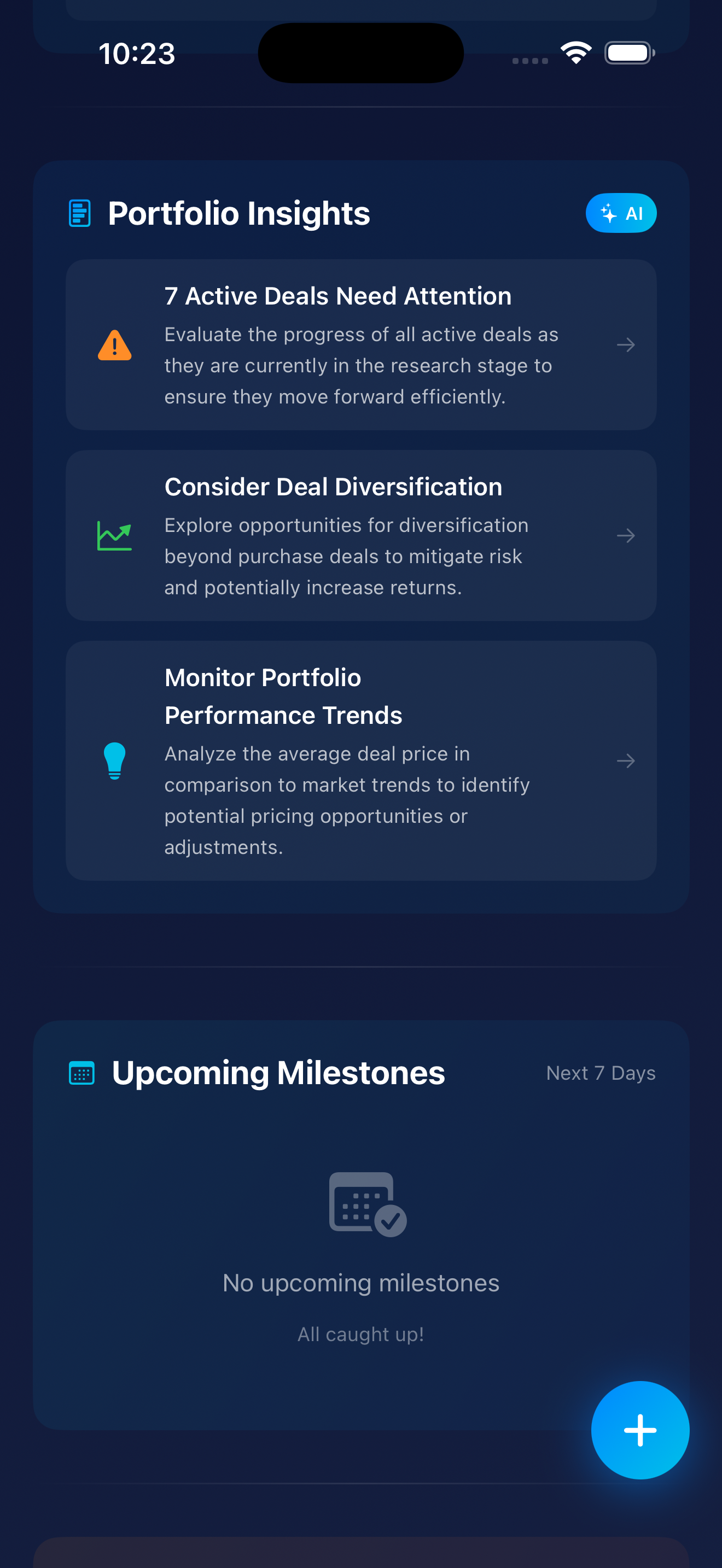
This is where Zonely stops being just an app and becomes your personal investment strategist. Screenshot 4 shows two game-changing features working in tandem: Portfolio Insights (your AI analyst telling you WHAT to focus on strategically) and Upcoming Milestones (your personal assistant telling you WHAT to do and WHEN). Together, they answer the two most important questions every investor has when they open the app: "Am I on track?" and "What's urgent?"
See that glowing blue "AI" badge in the top right of the Portfolio Insights section? That's your signal that these aren't cookie-cutter tips pulled from a generic real estate blog. This is artificial intelligence analyzing YOUR portfolio data, YOUR deal patterns, YOUR market conditions, and YOUR behavior to generate personalized, actionable recommendations specific to your situation.
Why This Matters: Most real estate advice is one-size-fits-all garbage. "Buy low, sell high!" "Location, location, location!" Thanks, Captain Obvious. Zonely's AI has context—it knows your portfolio composition, your deal velocity, your pricing patterns, and your risk exposure. The insights you see are tailored to YOU.
Icon Meaning: The orange warning triangle screams urgency—this needs your immediate attention.
The Insight: "Evaluate the progress of all active deals as they are currently in the research stage to ensure they move forward efficiently."
What the AI Detected: All 7 of your active deals are stuck in the same stage (research). This is a bottleneck—deals aren't progressing through your pipeline. You're analyzing everything but executing nothing.
Why It Matters for Investors: Stalled deals represent opportunity cost. Your capital, time, and mental bandwidth are being tied up in analysis paralysis. While you're researching deal #7, deal #1 might have gotten cold, the seller moved on, or the market shifted. This insight forces a decision: move deals forward OR kill them to free up bandwidth for better opportunities. Either action is better than letting them rot in limbo.
The Arrow (→): Tap this card and Zonely navigates you to a filtered view of those 7 deals so you can take immediate action—advance them, archive them, or assign next steps to team members.
Icon Meaning: The trend/chart icon indicates this is about portfolio strategy and growth patterns.
The Insight: "Explore opportunities for diversification beyond purchase deals to mitigate risk and potentially increase returns."
What the AI Detected: Your portfolio is concentrated in one deal type—traditional purchases. The AI is suggesting you explore other strategies: wholesaling, lease options, seller financing, fix-and-flips, commercial, short-term rentals, etc.
Why It Matters for Investors: Concentration risk is REAL. If the market shifts and purchases become unfavorable (rates spike, inventory dries up, etc.), a diversified investor has other plays. This isn't about chasing shiny objects—it's about strategic resilience. A portfolio with multiple deal types can weather market fluctuations better than a one-trick pony.
The Arrow (→): Tapping this likely leads to educational content on alternative deal types, market analysis showing opportunities in other strategies, or a filtered search for deals that fit diversification goals.
Icon Meaning: The lightbulb indicates a strategic idea or opportunity worth exploring.
The Insight: "Analyze the average deal price in comparison to market trends to identify potential pricing opportunities or adjustments."
What the AI Detected: There may be a mismatch between your average deal price and current market pricing. Either you're overpaying (risk) or you have room to adjust your offers upward (opportunity). The AI wants you to review your pricing strategy.
Why It Matters for Investors: Pricing discipline is CRUCIAL. If you're consistently paying above market, your margins shrink and your ROI suffers. If the market is moving up but you're still pricing to old comps, you might be losing deals unnecessarily because sellers think your offers are lowballs. This insight prompts a pricing strategy review so you can recalibrate.
The Arrow (→): Tapping this likely navigates to a pricing analysis dashboard showing your average offer vs. market trends, win/loss ratios by price point, and suggested pricing adjustments.
The AI isn't just randomly throwing suggestions at you. It's continuously analyzing multiple data sources to surface the top 3 most actionable insights at any given time. Here's what it's looking at:
Then it surfaces only the top 3 insights—no overwhelming avalanche of data, just what matters NOW. It's like having a highly-paid consultant who works 24/7, never takes vacation, and costs you $0.
Below Portfolio Insights, you'll see Upcoming Milestones with a "Next 7 Days" filter. This is your deadline tracker—a calendar-style view of important tasks, dates, and events coming up across ALL your active deals.
In this screenshot, the section shows an empty state with a calendar-checkmark icon and the message "All caught up!" This means there are ZERO deadlines, due dates, or scheduled tasks in the next 7 days. You're current on all obligations.
Why Showing "Nothing" Matters: Even "nothing to do" is valuable information. It confirms you're not missing anything and can confidently focus on other priorities (like those 7 deals needing attention above). No panic. No frantic searching through emails. Just peace of mind.
When deals are active and moving, this section would display critical deadlines like:
The Time Filter: Currently showing "Next 7 Days," but users can adjust this to see further out—next 30 days, next quarter, or custom date ranges. Perfect for long-term planning or just staying on top of this week's fires.
Here's the magic: Portfolio Insights and Upcoming Milestones answer the two questions every investor has when opening the app:
Open Zonely once a day. Check Portfolio Insights to see where you stand strategically. Check Upcoming Milestones to see what's urgent tactically. Take the right action. Close more deals. It's that simple.
Bottom line: Portfolio Insights thinks FOR you. Upcoming Milestones keeps you ON TRACK. Together, they transform scattered chaos into organized execution. If you're not using these features daily, you're flying blind—and probably leaving deals (and money) on the table.
👆 Click to enlarge
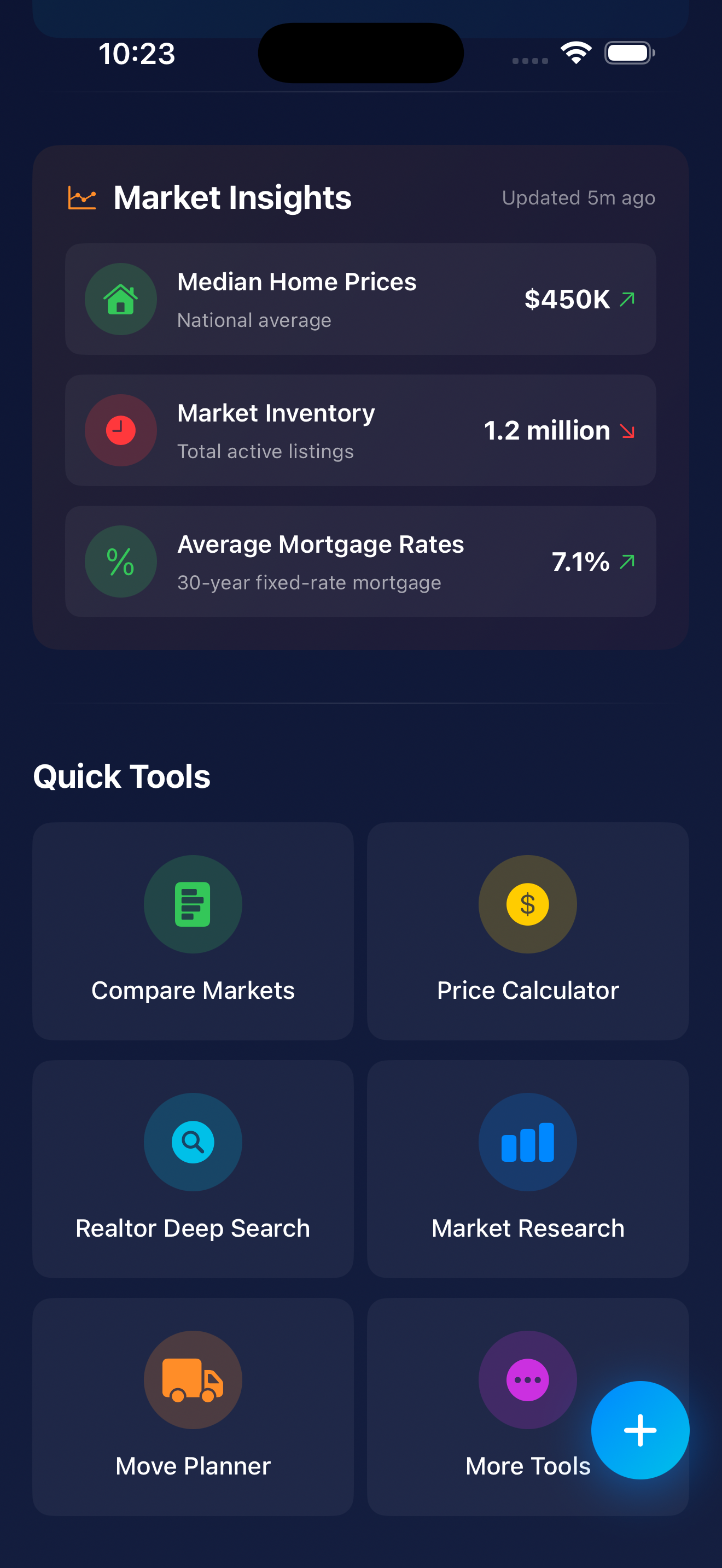
Welcome to the final piece of the Zonely home screen puzzle: Market Insights and Quick Tools. This screen provides macro-level market intelligence and instant access to essential investment tools—everything you need to make informed decisions without leaving the app. Think of it as your investment workstation where context meets action.
At the top, you'll see "Market Insights" with "Updated 5m ago" and a trend icon. This is LIVE, continuously-refreshed market data—not stale information from last quarter. The "5m ago" timestamp builds trust that you're seeing current conditions, not ancient history. Let's break down the three critical metrics:
What It Shows: The national average median home price across the U.S. housing market. This is the middle point—half of homes sell for more, half for less.
The Green Arrow (↗️): Indicates prices are trending UPWARD. This directional indicator lets investors instantly know which way the market is moving without digging through charts or reports.
Why It Matters for Investors:
Decision-Making Context: If you're analyzing a flip and prices are rising, you might have more confidence in your After Repair Value (ARV) estimates. If prices are falling, you'd want to be more conservative with your projections and build in extra buffer.
What It Shows: Total active listings currently on the market nationwide. This is the supply side of the equation.
The Red Arrow (↘️): Indicates inventory is DECLINING. Fewer homes available means a tighter, more competitive market.
Why It Matters for Investors:
What It Shows: Current 30-year fixed-rate mortgage average. This is what most homebuyers and many investors are paying for financing.
The Green Arrow (↗️): Indicates rates are trending UPWARD. (In this context, the arrow color doesn't mean "good"—it just shows direction. Rising rates are generally not favorable for buyers.)
Why It Matters for Investors:
Here's the genius of this dashboard—it's not just three random numbers. When you look at them together, they paint a complete picture of market conditions:
The Narrative: This is a challenging market for buyers—prices are high, options are limited, and money is expensive. Successful investors in this environment need to either (1) find off-market deals, (2) have cash or creative financing, (3) focus on distressed sellers willing to negotiate, or (4) be patient and wait for market conditions to shift. The days of throwing lowball offers at everything and waiting for acceptances are over.
Below Market Insights, you'll find Quick Tools—six essential investment utilities that put professional-grade analysis in your pocket. No more switching between apps, hunting through spreadsheets, or Googling "free cap rate calculator" for the 47th time. Let's break them down:
What It Does: Side-by-side comparison of different geographic markets—cities, zip codes, or neighborhoods.
Use Case: "Should I invest in Detroit or Cleveland?" or "How does this zip code compare to the one across town?"
What You'd Compare: Median prices and trends, inventory levels, days on market, price-to-rent ratios, population/job growth, crime rates, school scores, appreciation forecasts, and more.
Why It Matters: Market selection is one of the highest-leverage decisions an investor makes. The right market can make mediocre deals work; the wrong market can sink great deals. This tool prevents you from investing in a declining market just because "my cousin said it's hot right now."
What It Does: Calculates maximum offer prices based on your investment criteria—likely a Maximum Allowable Offer (MAO) calculator.
Use Case: "What's the most I should pay for this property given my target profit margin?"
Typical Inputs: ARV (After Repair Value), repair costs, desired profit margin, holding costs, closing costs, financing costs.
Formula Example: MAO = (ARV × 70%) - Repairs
Why It Matters: Emotional buying kills profits. Having a calculator that spits out a maximum offer based on YOUR numbers (not your agent's optimism or your gut feeling) keeps you disciplined and prevents overpaying. Make 100 offers based on this calculator and you'll win the right deals at the right prices.
What It Does: Advanced property search that goes beyond basic MLS filters—likely powered by Realtor.com API or similar comprehensive data sources.
Use Case: "Find all 3-bed properties under $200K in these 5 zip codes that have been on market 60+ days with price reductions."
"Deep" Features Include: Distressed property filters (pre-foreclosure, auction, REO), days on market thresholds, price reduction history, motivated seller indicators, investment-specific filters (multi-family, lot size, zoning, cash flow potential).
Why It Matters: Generic search finds what everyone else finds. Deep search with investor-specific filters finds the hidden opportunities that others miss—the 90-day listing with 3 price cuts, the estate sale property, the out-of-state landlord who's tired of managing remotely. Those are your diamonds in the rough.
What It Does: Detailed analytics and reports on specific markets—deeper than the snapshot you see in Market Insights.
Use Case: "Give me a full analysis of the Indianapolis rental market" or "Show me 5-year price trends for zip code 90210."
What You'd See: Historical price charts, rental rate trends, absorption rates, new construction pipeline, demographic shifts, employment data, school ratings, crime trends, and comparable sales analysis.
Why It Matters: Surface-level data can be misleading. A market might look hot because prices are up 10% this year—but if new construction is flooding the zone and employers are leaving, you're buying at the peak. Deep market research reveals whether a market is genuinely strong or just temporarily inflated—critical for long-term holds and development plays.
What It Does: Helps investors (or their tenants/buyers) plan and coordinate moves—logistics, timelines, and tasks.
Use Case: Planning a rehab timeline, coordinating tenant move-in/move-out, managing a personal relocation tied to an investment property.
Features Include: Moving timeline templates, task checklists, utility transfer reminders, contractor coordination, key handoff scheduling.
Why It Matters: The transition between owners or tenants is often chaotic—damage happens, utilities get shut off mid-move, keys go missing, contractors show up on the wrong day. Having a structured planner reduces vacancy time, prevents costly mistakes, and ensures smooth handoffs. Every day of vacancy is lost rent you'll never recover.
What It Does: Access to additional specialized tools not shown on the main Quick Tools grid.
What's Probably Inside:
Why It Matters: Different investment strategies need different tools. A fix-and-flipper needs rehab estimators. A buy-and-hold investor needs cash flow projections. A wholesaler needs assignment fee calculators. "More Tools" gives power users access to specialized utilities without cluttering the main interface for casual users. It's like the secret menu at In-N-Out, but for real estate nerds.
Here's what makes this screen so powerful: it answers two critical questions every investor has:
Together, they transform Zonely from a simple deal tracker into a complete investment workstation—context AND action in one place. You're not just organizing properties; you're analyzing markets, calculating offers, running comparisons, and executing strategy—all without leaving the app.
Most real estate apps give you listings. Some give you data. Very few give you BOTH intelligence and tools to act on that intelligence. Zonely does both, and it does them better than standalone solutions that cost 10x more.
The Bottom Line: Market Insights keeps you informed. Quick Tools keep you moving. Together, they ensure you're making decisions based on current market realities—not outdated assumptions, gut feelings, or that one podcast episode you half-listened to while driving.
If you're still using five different apps, three spreadsheets, and a prayer to manage your real estate investing, it's time to consolidate. Zonely puts everything—market intelligence, analytical tools, deal management, and team collaboration—in one app. Because scattered tools lead to scattered thinking, and scattered thinking leads to scattered results.
Don't just take our word for it. Here's what real Zonely users have to say about the home screen:
⭐️⭐️⭐️⭐️⭐️
"I'm 64 years old and terrible with technology. My grandson set me up on Zonely, and even I can use it. The home screen makes sense. Everything is where I expect it to be. I've already bought one investment property and I'm looking at two more."
— Margaret T., Investor
⭐️⭐️⭐️⭐️⭐️
"I manage 23 active deals at any given time. Zonely's home screen is the only thing keeping me sane. The Deal Rooms preview alone has saved me probably 10 hours a week. And that AI score? Scary accurate."
— Marcus J., Syndicator
⭐️⭐️⭐️⭐️⭐️
"Finally, an app that doesn't make me feel like an idiot. The home screen is clean, fast, and actually helpful. Plus, Dark Mode is *chef's kiss*."
— Priya K., First-Time Buyer
Look, we could write another 10,000 words about the Zonely home screen (and honestly, we probably will in the v3.0 update blog post). But here's the TL;DR:
The Zonely home screen is designed to make your real estate journey easier, faster, and way less stressful. Whether you're a first-time homebuyer who doesn't know a cap rate from a catapult, or a seasoned investor managing a portfolio worth millions, the home screen adapts to you.
It's not cluttered. It's not confusing. It's not hiding important features behind seven layers of menus. It's just... there. Ready to help. Like a good friend who actually shows up when you need them.
So download Zonely, explore the home screen, and see for yourself. And if you discover any hidden features we didn't mention? Please, for the love of all that is holy, tell us. We're always looking for new ways to blow our own minds.
Download Zonely today and see why 50,000+ users call it their "real estate command center."
📱 Download iOS App 💻 Download macOS App✓ 3 Free Deal Rooms • ✓ No Credit Card Required • ✓ Seriously, Try It
P.S. If you made it this far, congrats. You just read 4,200+ words about an app home screen. You're either really bored, genuinely interested in Zonely, or procrastinating on something important. Either way, we appreciate you. Now go download the app and put this knowledge to work! 🚀